
This article is the fourth in the Design 101 Series: Fundamentals. This series gives you an overview of the basics of design so that you can make more informed decisions about how design enhances your business.
Check out the other articles in the series:
How the Psychology of Color can Advance Your Brand’s Mission
Have you ever truly thought about the impact color has on your life?
Color is powerful. It taps into the human subconscious and evokes certain emotional responses.
Color connects to our memories and the symbols in our subconscious. Color is the unspoken expression of our visual soul. Color can make you purchase a product or put it back on the shelf.
Color represents our thoughts, feelings, and emotions. Color speaks to how we see ourselves and even goes to the core of our racial identities (e.g. black, brown, red, yellow, white).
Color is definer, identifier, multiplier, and divider.
Color brings a decided tone and personality to your brand: fun, serious, traditional, modern, girly, or masculine. Color can represent all of these things. When it comes to your brand, you want to think carefully about the tone you’re conveying through color.
A luxury make-up brand might use a color that promotes a luxurious experience: white, cream, gold, and black. A cupcake bakery might use colors that convey light-hearted sweetness: bright pinks, blues, yellows, or even pastels.
Colors can have traditional meanings as well as contemporary associations. In the west, purple is traditionally associated with royalty, regalement, and spirituality. But it can also be used to convey fun, feminine fashion, and trendiness.
Traditional and contemporary associations with color should be taken into consideration when designing for your project or brand.
Color acts as an identifier. When used consistently, people will associate your color with your brand, creating a cohesive and easily recognizable brand identity. What do you picture when you think of McDonald’s? The golden arches, perhaps? What about Coca-Cola? The red aluminum can with the classic white script logo? Target? I always picture the red and white bull’s eye.
These iconic logos are a part of our culture. They are easily recognizable to us because they have been used consistently by the respective companies for decades. Consistency breeds familiarity.
Use color to targeting an audience. For example, surveys show that millennials tend to prefer the color black. 1 Traditionally, women’s products are associated with so-called “feminine” colors such as pinks, purples, and pastels. Men’s products tend to be dark: black, navy, gray, and red with white accents.
There are some colors that are gender neutral, such as red, blue, black, gold, silver, and white. Those colors convey the quality and value of the product more than a supposed gender of the consumer.
Color Theory Basics
Color is “created by varying wavelengths of light that, when reflected off a surface, are interpreted as color.” 2 The rods and cones in our eyes cause us to see color by enabling us to tell the difference between these rays and their frequency. 3
Viewers perceive particular colors by the degree to which a surface is able to reflect light and produce rays of different wavelengths. 4 Reds have the longest wavelengths while violets have the shortest. 5
Conversely, black absorbs all wavelengths of the visible spectrum while reflecting none of them to the eyes; white reflects all wavelengths of light. 6
Color temperature affects the mood of your brand. Colors that are made up of more yellows and reds are said to be warm colors, while colors dominated by blue tones are called cool.
The effect of warm colors is just as you would think—they make you feel warm, cozy, affectionate, familiar. Cool colors are refreshing, clean, calming, and innovative.
Color Value. The value of color is very important to consider when choosing a color for your brand. I don’t mean value as in monetary value but the relative degree of lightness or darkness of a color.
Adding white or black will change the value of a color. 7 This is an important concept in monochromatic color palettes, which display a wide range of color values within a single color palette.
Light colors/Dark colors. Light colors are based on pale shades (but still have some black mixed in). As colors get lighter, the contrast between hues decreases. Light shades serve well as good accent and background colors. They can also balance brighter and more saturated shades within a color palette. 8
Dark colors contain black, and they can add intensity and drama to a color palette. Colors with dark values can have less contrast as they get darker. Adding lighter, more saturated colors to your palette help to achieve balance. 9
Bright colors/Pale colors. Bright colors display full saturation of color without adding white or black. They use pure pigment. Bright colors are bold and attention-grabbing. They are great for advertising and highlighting products. Pale colors are hues that are made of more than 65% white. 10
Pale colors, such as pastels, have certain cultural connotations to them. They are associated with newborns, weddings, and Easter. Pastels are associated with innocence, purity, and femininity.
Hot colors/Cold colors. Some like it hot; some like it cold. Hot colors are based on warm tones that have red in them. A hot color is usually warm and bright. Some examples are bright orange, scarlet, and magenta.
Cold colors are cool tones that are based on the primary color blue. Cold colors recede in the background, while hot colors advance.They can be used to communicate trust and conservativeness.11
Neutral colors. Neutral colors are hues that contain a large percentage or brown or gray. They tend to be overlooked and underutilized. Neutral colors bring balance to a composition. They are nice as backgrounds and are much more calming and easy on the eyes than stark white in terms of white space.
How Colors Work Together
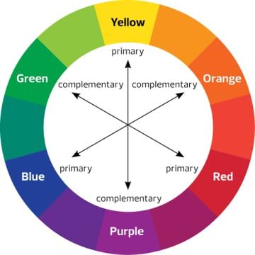
The color wheel is a representation of primary, secondary, and tertiary colors that, when combined with each other and black and white, make up all possible color combinations of the visible spectrum.
Primary colors. Red, yellow, and blue. They are called primary colors because they are the only colors you cannot create.

Secondary colors. Secondary colors are created by equally combining two primary colors. Red+yellow=orange. Red+blue=purple. Blue+yellow=green.

Tertiary colors. These colors are created by equally combining a primary color with a secondary color. Blue + green = blue-green

Complementary. Colors directly across from each other are opposite on the color wheel. Because they are opposites, they work best when one is the main color and the other is the accent. 12
Split Complementary. To find the split compliment, choose a color, look directly across to its complement, and pick the color on each side to achieve split complement. More complex color palette.

Analogous. These are series of color directly in sequence with each other. Creates a harmonious color combination.

Tints and shades. A tint is created when you add white to a hue. A shade is created when you add black to the same hue.

Monochromatic. This is a combination made of the tints and shades of one hue.

Color and Production
How are colors created in print > CMYK.

CMYK is a color blend that is used in print production. Desktop and commercial printers mix three colors and black together to produce the desired colors in your document or publication. C=cyan, M=magenta, Y=yellow, and K=key, usually pure black.
Any design project that is going to print, such as magazines, newsletters, rack cards, business, cards, letterhead, envelopes, etc., will need to be set in the CMYK color blend mode. This will ensure the most accurate representation of your color design.
Most desktop publishing software and graphic design software will allow you to select the CMYK mode for your project.
How are colors created on screen > RGB.

Colors for web and digital projects are produced differently than print projects. R=red, G=green, and B=blue.
The RGB model is a device-dependent, additive color model in which red, green, and blue light are added together in various ways to reproduce a broad array of colors.
The main purpose of RGB is for the representation and display of images in electronic systems, such as television and computers. This also extends to digital devices like smartphones and tablets.
Other color systems
Hexidecimal. When working with a designer, along with supplying you with your brand’s CMYK and RGB colors, she will also provide your colors in a hex code format.
Hex codes are made of up of letters and numbers and always include a pound sign in front of the six-character code.
For example, black is #000000. Pure white is #ffffff or #FFFFFF.
Hex codes are not case-sensitive, so using upper or lower case letters will produce the same result. Hex code is specifically for use on the web. It is used in HTML and CSS code to display colors on a web page. Color-Hex Color Codes is a great resource for hex colors.
Pantone. Pantone is a proprietary color-matching system used by industry leaders in fashion, design, printing, and more.
Founded in 1963 by Lawrence Herbert, the Pantone system was created to “solve the problems associated with producing accurate color matches in the graphic arts community.” 13
Pantone produces color swatches of 1,867 colors for print production, with their four-color process (CMYK) designations, for coated and uncoated paper.
Some Key Takeaways
- Color taps into the human subconscious and evokes certain emotional responses
- Colors have traditional meanings as well as contemporary associations
- The meanings of color are affected by light, dark, saturation, and temperature.
- All color combinations stem from the three primary colors red, yellow, and blue.
- Print and digital have their own “primary colors”: CMYK and RGB, respectively.
- Color palettes are composed of endless combinations of primary, secondary, and tertiary colors.
- The color blend you use in design is based on your final output: print, web, or mobile.
Footnotes:
- Sarah Tariff. “Millennials have a Favorite Color, and it’s not Pink,” Elle Decor, last modified May 17, 2017, accessed August 17, 2017. http://www.elledecor.com/design-decorate/color/a9937513/millennials-favorite-color/.
- Aaris Sherin, Design Elements: Color Fundamentals (Beverly, Massachusetts: Rockport Publishers, 2012), 10.
- Ibid.
- Ibid.
- Robin Williams, The Non-Designers Design Book, 4th ed. (San Francisco: Peachpit Press, 2015).
- “Are Black and White Colors?” Color Matters, accessed August 17, 2017. https://www.colormatters.com/color-and-design/are-black-and-white-colors.
- Aaris Sherin, Design Elements: Color Fundamentals (Beverly, Massachusetts: Rockport Publishers, 2012), 10.
- Ibid, 96.
- Ibid, 97.
- Ibid, 99.
- Ibid, 101.
- Robin Williams, The Non-Designers Design Book, 4th ed. (San Francisco: Peachpit Press, 2015), 98.
- “About Pantone,” Pantone.com, accessed August 20, 2017. https://pantone.com/about-us.
Further Reading:
Color Matters. https://www.colormatters.com/.
Anne Diedrich. “How to Attract Millennials with Color,” MultiHousing News, last modified May 10, 2015, accessed August 17, 2017. https://www.multihousingnews.com/post/how-to-attract-millennials-with-color/.