
This article is the third in the Design 101 Fundamentals series. This series gives you an overview of the basics of design so that you can make more informed decisions about how design enhances your business.
Check out the other articles in the series:
The Importance of Typography
Communicate Your Message through Effective Use of Typography
Typography is integral to your visual branding. It is one of the first things you need to consider when creating your brand, logo, and the messaging that will go along with it.
Effective use of typography will resonate with your audience and help further your business message and goals. Poor use of typography, at its worst, will confuse your customers, reduce credibility, and hamper your brand message.
It takes time to choose a typeface for your logo and branding element. A well-considered typeface signifies your personality, values, and priorities. A handwritten, informal typeface might not be appropriate for a law firm. Similarly, a formal
A handwritten, informal typeface might not be appropriate for a law firm. Similarly, a formal oldstyle serif font doesn’t convey the sense of fun and innocence for a children’s clothing shop.
The typeface you use for your business should be congruent with your company’s vision and values.
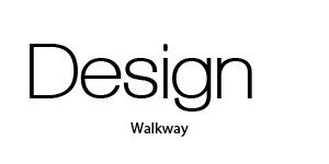
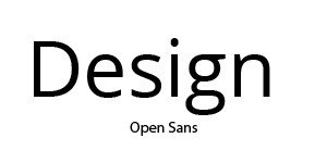
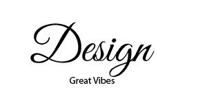
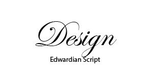
Shapes of letter forms
Letters come in all shapes and sizes. Shape and size are fundamental elements of design.
Design involves various shapes and sizes of elements that tell a story or convey an idea. Letterforms, in and of themselves, are shapes with imbued with meanings.
We give meanings to these letterforms, and we memorize their meanings by their shapes. This is a universal concept for all languages.
The sizes and shapes of letterforms impact your design at the fundamental level. They tell a story about your business. Is your business formal, fun, inspirational utilitarian, or spiritual?
Your company’s typographical choices convey the tone of your business.
The difference between a font and a typeface.
James Felici, the author of The Complete Manual of Typography, explains the differences between fonts and typefaces: “A typeface is a collection of characters—letters, numbers, symbols, punctuation marks, etc.—that are designed to work together like the parts of a coordinated outfit. A typeface is an alphabet with a certain design.”
On the other hand, a font is “a physical thing, the description of a typeface—in computer code, photographic film, or metal—used to image the type. The font is a cookie-cutter, and the typeface is a cookie.” (1)
In modern parlance, the font and typeface of the word are used interchangeably. But the correct way to think of the two is that the font is a mechanism that produces the typeface.
Being that computers are the main way we produce typefaces for our publications, the font is the program or code that provides the typeface used in our web, print, and mobile materials.
James offers further explanation:
The confusion between the terms arises largely from the ambiguous use of the term font in computer programs, most of which have a Font menu. Although that menu lists what fonts are available for use by the program, it could just as easily be called the Typeface menu, as it also lists the typefaces available for your pages. In fact, since some fonts contain data for more and one typeface, it would be more accurate to call it a Typeface menu.
Typography Relationships
Understanding how typefaces relate to each other can be challenging.
There are three relational concepts to consider when pairing different typefaces: concordant, conflicting, and contrast.
Aptly put by designer Robin Williams: “Creating concord is pretty easy, and creating conflict is easy but undesirable. Creating contrast is just fun.” (2)
Concordant. An example of creating concordance in your written content is to use just one typeface. “A design is concordant when you choose to use just one typeface and other elements on the page have the same qualities as that typeface.” (3)
Many typefaces come with various weights and standard styles such as italic and bold. So using the various weights and styles together in one typeface is a nice congruent style. The typeface is not in conflict with itself. But there’s not much contrast, which could make for a dull design.
Conflicting. Conflict occurs when pairing serif/serif types or sans/sans types that are too much alike.
Williams states, “A design is in conflict when you set two or more typefaces on the same page that are similar—not really different but not really the same. When you put two typefaces together that look too much alike without really being so, most of the time it looks like a mistake.” (4)
In most cases, using two similar typefaces doesn’t produce enough contrast to be visually pleasing.
Contrasting. “Strong contrast attracts our eyes. One of the most effective, simplest, and satisfying ways to add contrast to a design is with type.” (5)
Using truly contrasting typefaces is a great way to add an interesting design to your work. This can be easily done by paring serif with a sans serif as the heading or body or vice versa.
Typography Categories
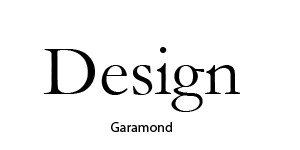
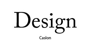
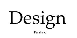
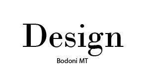
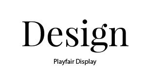
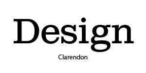
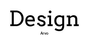
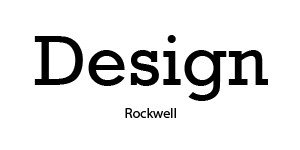
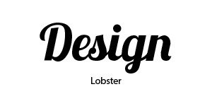
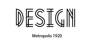
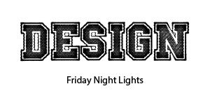
- Oldstyle. Oldstyle font is based on hand lettering created by scribes. Oldstyle always uses a serif, and the serifs in the lowercase letters always end in an angle and curve where they meet the stem. All curved strokes in the letterforms have a transition from thick to thin.

How to Select the Right Typography for Your Brand
What do you want to communicate about your brand? If you own a bakery shop, you might opt for something fun and whimsical. If you designer, you might want something clean and bold. If you are Fortune 500 company, you might use stately yet classic typeface.
Again, it all depends on your mission, values, personality, and goals. Working with a designer will help you clarify your brand message and identify which style you should adopt for your business. Here is a handy Brand Self-audit Kit to help you get started.
Print projects and web projects. Choosing typefaces for your projects goes back to your brand message. Once you select your fonts for your overall brand, you’ll need a secondary font for all of your supporting marketing material. The two can be the same or different. But overall, use fonts that are clean, readable, and help get your message across.
Licensing fonts. Before you fall in love with a typeface, be sure you have permission to use it. In general, if you purchase a font for commercial use, be it your own or a client’s, you are pretty much in the safe zone.
However, if you borrow a font or use a font for commercial purposes (meaning you will use the font to promote and sell services, goods, or merchandise), there is a chance you could be breaking the law.
Consider these different scenarios for determining if you need a license for your marketing or branding project. Even if you just run a personal blog, you still need to be aware of how to lawfully use fonts. (6)
- Free for personal use. P There are plenty of web-based font foundries provide fonts for personal use only. This restriction is usually stated on the download page. Sometimes it’s obvious and sometimes it’s not. It’s your responsibility to verify that this is the case.
- Free for commercial use. Fonts can also be free for commercial use. For example, all Google fonts are free for personal and commercial use. Meaning you can install the fonts on your computer for your own memos, letters, word processing programs, and etc. But you can also use those fonts to create logos and branding collateral for yourself or others.
- Purchase license for commercial use. Font foundries like MyFonts, only allow you to purchase font licenses for commercial use. They often have a separate license for:
- your desktop (for desktop publishing of print document and static images)
- web fonts (used to embed in your website)
- mobile applications
- e-publications (e-books, interactive PDF, e-magazine, e-newspaper)
- server, for applications that produce a deliverable with the fonts embedded
As you can see, licensing fonts can get a bit complicated. Make sure you read the fine print anytime you consider using a particular font for your project.
Where to Find Fonts
- Creative Market. Creative Market is a great resource for licensing unique fonts. The site also features free fonts for download. But be sure to verify whether or not the font can be used for commercial use or personal use only.
- FontSquirrel. FontSquirrel provides hundreds of fonts that are 100% free for commercial use. Meaning you can use all of the fonts on their site for your business’s branding needs and the needs of your clients. You do not have to pay a fee to use these fonts for commercial and professional use. They offer fonts in all styles that can be embedded in web pages, PDFs, ebooks, and other applications. Head on over there and take a look.
- Google Fonts. Over 800 open-source designer web fonts are available at Google Fonts. All of the fonts are free for commercial and personal use and integrate seamlessly with design applications and web pages. Test out different fonts and see which ones pair well together at Google Fonts.
- MyFonts. Paid for commercial use.
- Fonts.com. Paid for commercial use.
- Fontshop.com. Free and paid fonts.
- Adobe TypeKit. If you have an Adobe Creative Cloud subscription, Adobe TypeKit is included, and it syncs to all your Adobe applications.
Key Takeaways
- Typography is integral to your branding message. Effective typography will resonate with your audience and help further your business mission and goals.
- Typeface relationships can create either concordance, conflict, or contrast in your web and print design.
- Typefaces come in several categories including old style and modern serif, slab serif, sans serif, script, and decorative.
- Choosing the right font for your brand or project involves your overall business goals, the materials you desire to produce, and proper font licensing.
- Generally, licensing falls into three broad categories: free for personal use, free for commercial use, and purchase for commercial use.
- There are several font foundries on the web. Some offer free fonts, some offer paid, and some offer both. Be sure to read the fine print for restrictions and licensing details.
Was this guide helpful? Let me know in the comments below!
Footnotes:
- James Felici, The Complete Manual of Typography: A Guide to Setting Perfect Type (Berkeley: Peachpit Press, 2003), 29.
- Robin Williams, The Non-Designers Design Book, 4th ed. (San Francisco: Peachpit Press, 2015), 172.
- Ibid., 168.
- Ibid.
- Ibid., 172.
- Graham Smith, “A Brief Summary of Font Licensing: Some Do’s and Don’t’s,” The Logo Smith, last modified, September 14, 2016, accessed August 10, 2017. https://imjustcreative.com/brief-summary-font-licensing/2014/06/12.